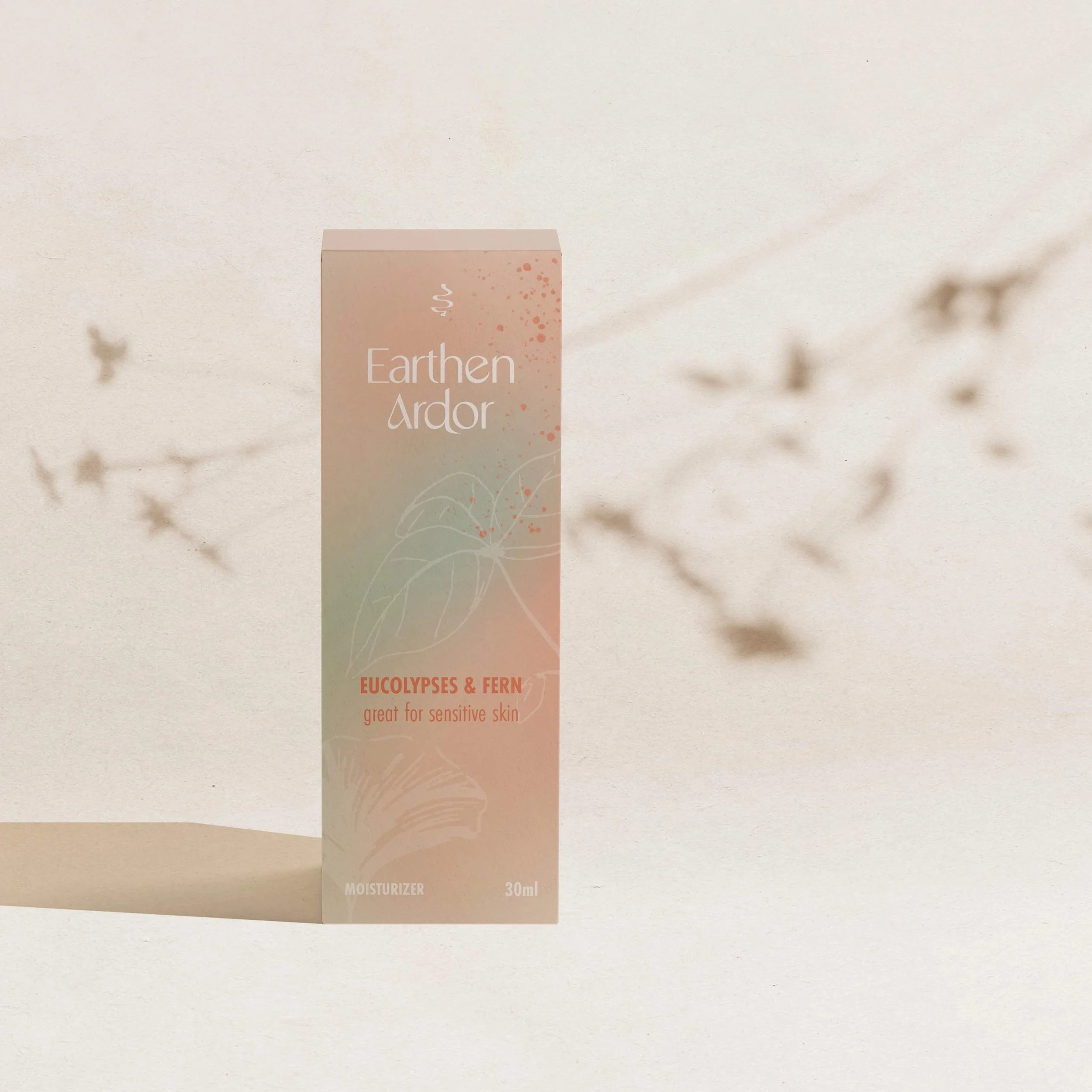
EARTHEN ARDOR
NAMING
brand design
Shopify website
Nature & Science Based Skincare & Wellness Brand.
Earthen Ardor is a skincare brand nestled where nature meets science, created by a nurse with a passion for holistic wellness. Each product is thoughtfully formulated, blending natural ingredients with science to nurture your skin and enhance your well-being. With a deep respect for both the earth and your health, Earthen Ardor offers skincare that’s as effective as it is gentle, supporting a balanced and radiant complexion.

THE PROBLEM
Having just started the business, Gina had tested products but no business name. She wanted to start strong with a name, brand and website that would help position her as the cross section of nature and science.
THE SOLUTION
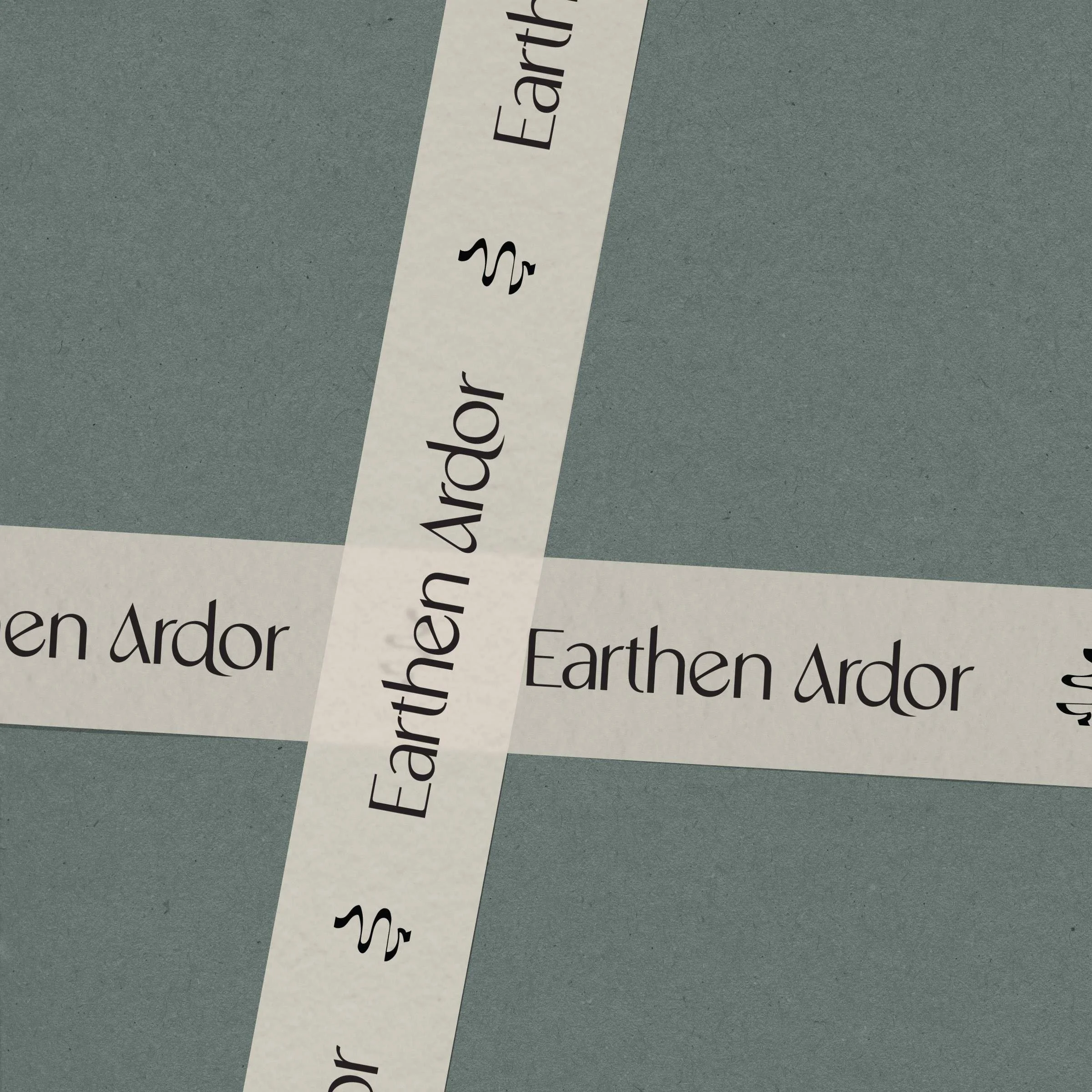
We explored several name options, but felt ‘Earthen Ardor’ showed the natural inspiration, devotional origins, along with an easy to remember and spell name. For the branding, we included custom illustrations and layered elements to show the depth and research layering into each product. For the brand mark, we were inspired by the Rod of Asclepius to bring in her nursing background.
“Form & Flow saved my sanity! Tasha walked me through everything I needed to think about to develop a great foundation for my brand.
She brought clarity and helped me bring my thoughts and desires to life in my brand. Tasha has a wealth of knowledge and proved to be the best investment I had made for my business. And her team worked miracles on my website! Now I have direction as I move forward in my business and know who my audience is. I'm so grateful for the opportunity to work with Form & Flow Studio!”