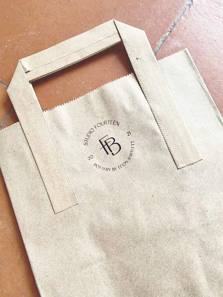
STUDIO FOURTEEN
brand strategy
brand identity
A BRAND IDENTITY FOR A SELF TAUGHT POTTER.
Ffion is the owner and maker behind the pottery studio Studio Fourteen. After learning about pottery from her stepdad, she loved how beautiful, lovingly crafter potter was able to elevate everyday moments.
We crafted her a brand that would do exactly that. Clean lines, small details, and lots of imperfect shapes brought out the love and joy found in each moment.
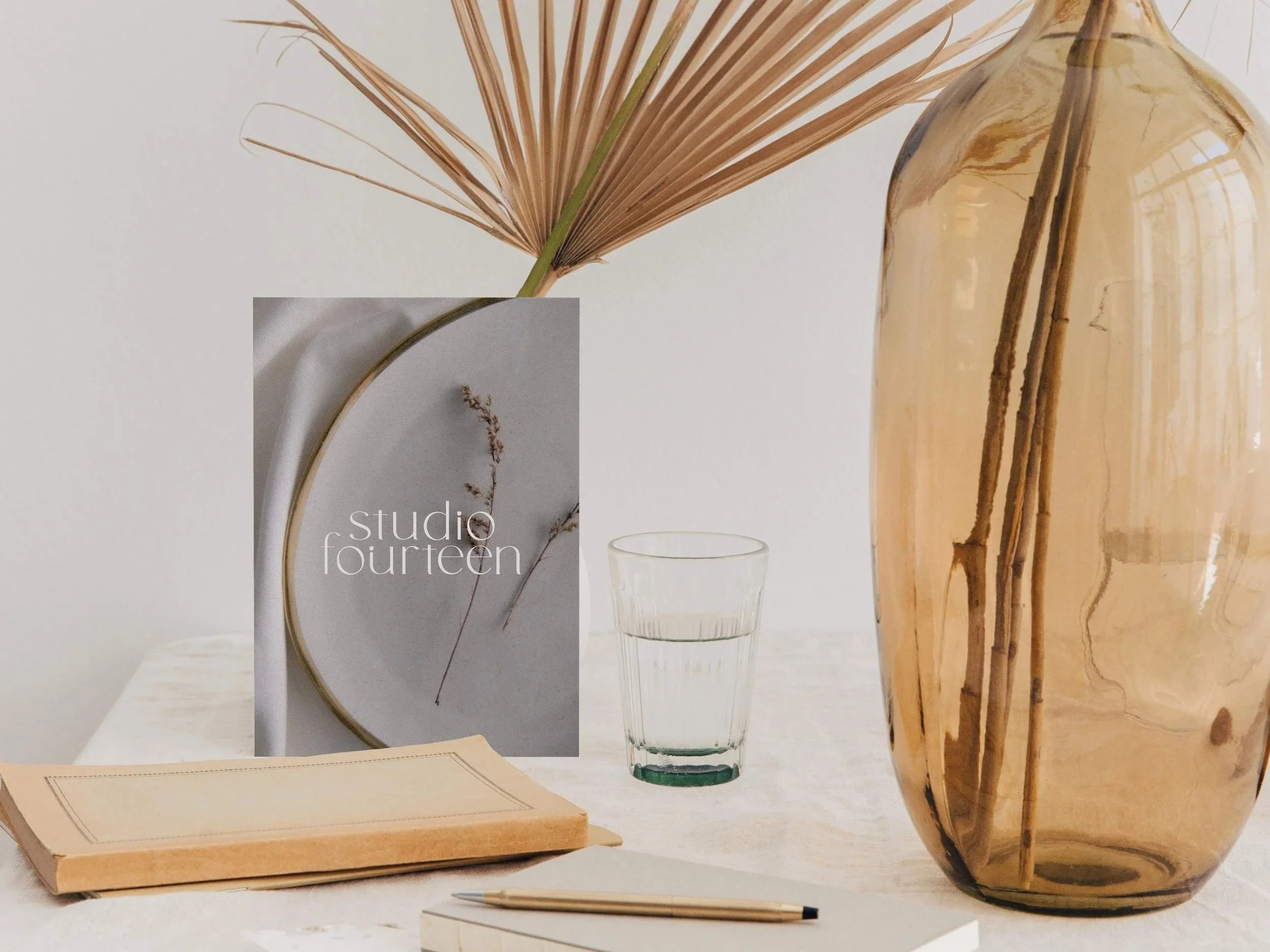
THE PROBLEM:
She was starting her pottery business and needed a brand that would both communicate her quality but also the variety of her work. We wanted something professional, slightly playful, and flexible.
THE SOLUTION:
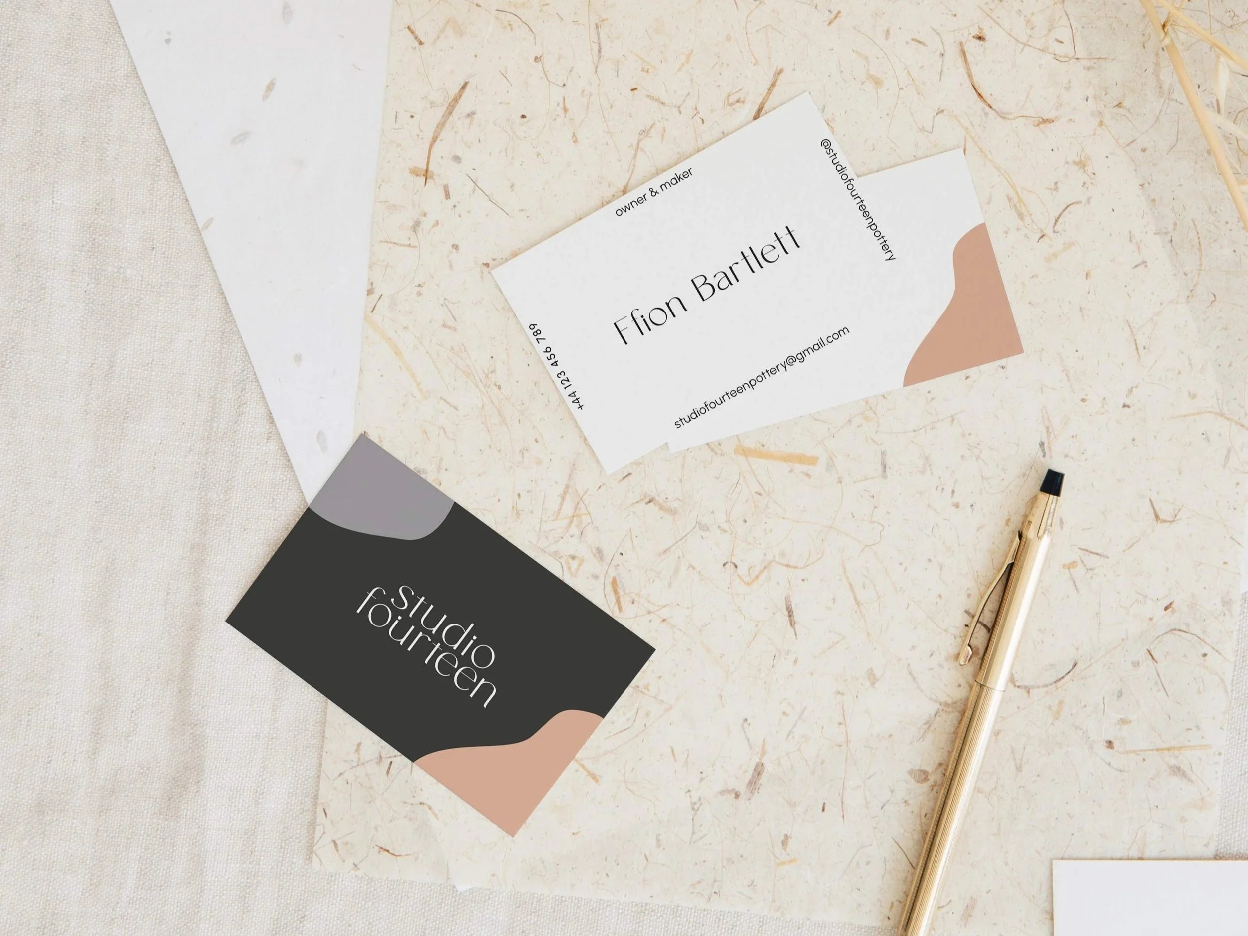
A brand that was elevated yet playful, a flexible mark, and something that can grow with her as she explores her style as an artist. We went for a playful but muted colour palette, organic shapes to reflect her work, with a friendly and welcoming wordmark.
“From start to finish, Tasha guided me through the whole process. Her knowledge and confidence in what she does was incredibly reassuring, and it allowed me to put my trust in her to create something beautiful.
Being unsure of what I wanted to begin with, Tasha took my jumbled mess of ideas and created branding and a makers mark that was professional, yet personal. It was more perfect for my brand than I ever could’ve hoped for.
One of the most interesting parts was the way she explained the importance of having a clear brand identity and really delved deep with me into what mine was. She was incredibly reliable, delivered exactly when she said she would and exceeded my expectations in every area of the process. If you are a business owner, I can’t recommend Form & Flow Studio enough.”
— FFION, STUDIO FOURTEEN